- The ZEC chart shows a strong rise in bubble risk with a 1.69 reading that matches past areas linked with sharp market turns.
- Color zones show how risk builds from blue to red, which helps traders compare current pressure with earlier cycles in the chart.
- The price line rises as bubble risk grows, which gives traders a view of how current action may relate to past times of high heat.
ZEC posted a short-term bubble risk value of 1.69 as the chart displayed a rising cluster of red zones that matched earlier periods linked with faster market pressure while price continued to move higher into late 2025. The chart combined historical risk readings with long-term price action to show how the current level compared with earlier cycles. Traders monitored this development closely as it formed near regions that previously produced strong reactions.
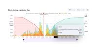
ZEC Bubble Risk Metric Reaches Its Upper Range
The bubble risk chart measured ZEC through several color bands that shifted between low and high intensity. Blue and dark blue zones marked low-risk periods, while green and yellow bands reflected moderate activity. Orange and red areas represented the highest short-term readings.
The latest value of 1.69 placed ZEC in a risky zone. The chart showed this reading with intense red shading at the far right section. Earlier cycles in 2017, 2018, and 2021 also displayed similar red zones during major swings. These cycles created a reference point for traders who compared current conditions with earlier patterns.
Price action moved in line with these changes as the price curve rose during the periods where orange and red zones appeared. The chart captured several moments where high-risk clusters aligned with strong upward expansion. This allowed traders to map the relationship between risk levels and market movement.
Historical Pattern Shows Recurring High-Risk Clusters
The chart extended back to 2017, which provided a long view of how ZEC behaved during high-risk periods. The first major spike appeared early in the chart, where the bubble risk value crossed the upper range. Price then moved sharply, which marked one of ZEC’s strongest periods.
Additional red zones formed in 2018 and 2021. These zones aligned with market peaks as the price reached the upper sections of the chart. Between these peaks, the risk readings often dropped into blue and cyan bands, which showed lower heat. This alternating pattern created a cycle-style rhythm that could be used for comparison.
The current red cluster formed after a long period of low and mid-range readings across 2023 and early 2024. As prices rose through 2025, the chart shifted from blue to green, then yellow and orange, before reaching the current red region. This created a familiar sequence that matched earlier cycle behavior.
A key question emerged for traders. Will ZEC repeat its earlier cycle responses now that bubble risk readings have reached a 1.69 level?
Price Moves Higher as Risk Curve Expands
The price curve on the right side of the chart showed ZEC rising toward levels last seen during earlier expansions. While the price remained below historical highs, it moved in a direction consistent with prior high-risk clusters. This suggested that market activity increased during the recent rise.
The ZEC price line also displayed a pattern of steady climbs followed by sharp corrections after past bubble risk spikes. These corrections appeared during the sections marked in deep red. The current spike, therefore, helped traders evaluate whether a similar sequence may develop.
The bubble risk metric chart allowed traders to compare multiple cycles directly. By pairing the price curve with the colored risk waves, the chart provided a framework for understanding ZEC’s short-term heat and how it related to past movement. This created an informed basis for monitoring the next phase of market behavior.